使用 ggplot2 在 R 中绘制散点图(附示例)
图表是数据分析过程的第三部分。第一部分是关于数据提取,第二部分处理数据清洗和操作。最后,数据科学家可能需要以图形方式传达其结果。
数据科学家的工作可以通过下图回顾
- 数据科学家的第一个任务是定义一个研究问题。这个研究问题取决于项目的目标。
- 之后,最突出的任务之一是特征工程。数据科学家需要收集、操作和清洗数据
- 完成这一步后,他就可以开始探索数据集。有时,由于新的发现,有必要修改和更改原始假设。
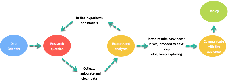
- 当完成解释性分析后,数据科学家必须考虑读者理解潜在概念和模型的能力。
- 他的结果应以所有利益相关者都能理解的格式呈现。传达结果的最佳方法之一是通过图表。
- 图表是简化复杂分析的绝佳工具。
ggplot2 包
本教程部分重点介绍如何使用 R 制作图表。
在本教程中,您将使用 ggplot2 包。该包建立在 Wilkinson 于 2005 年撰写的《图形语法》一书一致的基础之上。ggplot2 非常灵活,融合了许多主题和高级别的图表规范。使用 ggplot2,您无法绘制三维图形或创建交互式图形。
在 ggplot2 中,一个图表由以下参数组成
- 数据
- 美学映射
- 几何对象
- 统计变换
- 刻度
- 坐标系
- 位置调整
- 分面
您将在教程中学习如何控制这些参数。
ggplot2 的基本语法是
ggplot(data, mapping=aes()) +
geometric object

arguments:
data: Dataset used to plot the graph
mapping: Control the x and y-axis
geometric object: The type of plot you want to show. The most common object are:

- Point: `geom_point()`
- Bar: `geom_bar()`
- Line: `geom_line()`
- Histogram: `geom_histogram()`
散点图
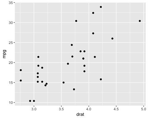
让我们看看 ggplot 如何与 mtcars 数据集一起工作。您首先绘制 mpg 变量和 drat 变量的散点图。
基本散点图
library(ggplot2)
ggplot(mtcars, aes(x = drat, y = mpg)) +
    geom_point()
代码解释
- 您首先将 mtcars 数据集传递给 ggplot。
- 在 aes() 参数内,您添加 x 轴和 y 轴。
- “+”号表示您希望R继续读取代码。它通过断开代码来提高代码的可读性。
- 使用 geom_point() 作为几何对象。
输出
带分组的散点图
有时,区分数据组(即因子级别数据)的值会很有趣。
ggplot(mtcars, aes(x = mpg, y = drat)) +
    geom_point(aes(color = factor(gear)))
代码解释
- geom_point() 中的 aes() 控制组的颜色。组应该是因子变量。因此,您将 gear 变量转换为因子。
- 总而言之,您有代码 aes(color = factor(gear)),这会改变点的颜色。
输出

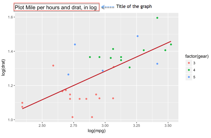
更改轴
重新缩放数据是数据科学家工作的重要组成部分。在极少数情况下,数据会呈现漂亮的钟形。使数据对异常值不那么敏感的一个解决方案是重新缩放它们。
ggplot(mtcars, aes(x = log(mpg), y = log(drat))) +
    geom_point(aes(color = factor(gear)))
代码解释
- 您直接在 aes() 映射中将 x 和 y 变量转换为 log()。
请注意,可以应用任何其他转换,例如标准化。
输出

带拟合值的散点图
您可以向图表中添加另一个信息层。您可以绘制线性回归的拟合值。
my_graph <- ggplot(mtcars, aes(x = log(mpg), y = log(drat))) +
    geom_point(aes(color = factor(gear))) +
    stat_smooth(method = "lm",
        col = "#C42126",
        se = FALSE,
        size = 1)
my_graph
代码解释
- 图表:您将图表存储在 graph 变量中。这有助于进一步使用或避免过于复杂的代码行
- stat_smooth() 参数控制平滑方法
- method = “lm”: 线性回归
- col = “#C42126”: 线条的红色代码
- se = FALSE: 不显示标准误差
- size = 1: 线条大小为 1
输出

请注意,还有其他平滑方法可用
- glm
- gam
- loess: 默认值
- rim
为图表添加信息
到目前为止,我们还没有在图表中添加信息。图表需要提供信息。读者只需查看图表,无需参考额外文档,就能看到数据分析背后的故事。因此,图表需要良好的标签。您可以使用 labs() 函数添加标签。
lab() 的基本语法是
lab(title = "Hello Guru99")
argument:
- title: Control the title. It is possible to change or add title with:
- subtitle: Add subtitle below title
- caption: Add caption below the graph
- x: rename x-axis
- y: rename y-axis
Example:lab(title = "Hello Guru99", subtitle = "My first plot")
添加标题
一个必须添加的信息显然是标题。
my_graph +
    labs(
        title = "Plot Mile per hours and drat, in log"
         )
代码解释
- my_graph: 您使用存储的图表。这可以避免每次向图表添加新信息时都重写所有代码。
- 您将标题包装在 lab() 中。
- 线条的红色代码
- se = FALSE: 不显示标准误差
- size = 1: 线条大小为 1
输出
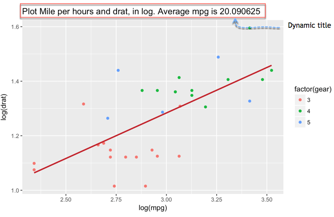
添加动态名称的标题
动态标题有助于在标题中添加更精确的信息。
您可以使用 paste() 函数打印静态文本和动态文本。paste() 的基本语法是
paste("This is a text", A)
arguments
- " ": Text inside the quotation marks are the static text
- A: Display the variable stored in A
- Note you can add as much static text and variable as you want. You need to separate them with a comma
示例
A <-2010
paste("The first year is", A)
输出
## [1] "The first year is 2010"
B <-2018

paste("The first year is", A, "and the last year is", B)
输出
## [1] "The first year is 2010 and the last year is 2018"
我们可以为我们的图表添加一个动态名称,即 mpg 的平均值。
mean_mpg <- mean(mtcars$mpg)
my_graph + labs(
    title = paste("Plot Mile per hours and drat, in log. Average mpg is", mean_mpg)
)
代码解释
- 您使用 mean(mtcars$mpg) 创建 mpg 的平均值,并将其存储在 mean_mpg 变量中
- 您使用 paste() 和 mean_mpg 来创建动态标题,显示 mpg 的平均值
输出
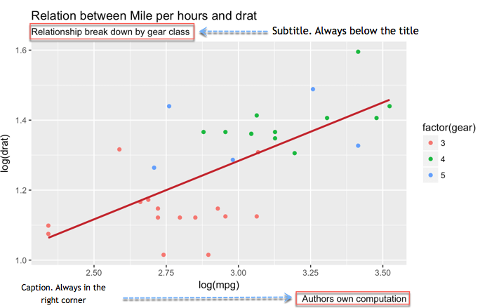
添加副标题
两个附加细节可以让您的图表更清晰。我们讨论的是副标题和注释。副标题紧跟在标题下方。注释可以说明是谁进行的计算以及数据的来源。
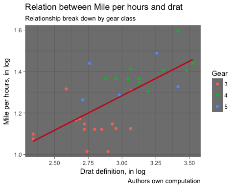
my_graph +
    labs(
        title =
        "Relation between Mile per hours and drat",
        subtitle =
        "Relationship break down by gear class",
        caption = "Authors own computation"
    )
代码解释
- 在 lab() 中,您添加了
- title = “车速与 drat 关系”: 添加标题
- subtitle = “按档位类别细分的车速关系”: 添加副标题
- caption = “作者自己计算: 添加注释
- 我们用逗号 , 分隔每个新信息
- 请注意,我们换行了代码。这不是强制性的,只是为了方便阅读代码
输出
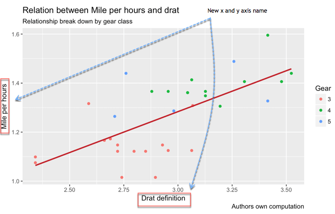
重命名 x 轴和 y 轴
数据集中的变量本身可能并不总是明确的,或者按惯例,当有多个单词时使用下划线(例如,GDP_CAP)。您不希望这样的名称出现在您的图表中。更改名称或添加更多详细信息(如单位)很重要。
my_graph +
    labs(
        x = "Drat definition",
        y = "Mile per hours",
        color = "Gear",
        title = "Relation between Mile per hours and drat",
        subtitle = "Relationship break down by gear class",
        caption = "Authors own computation"
    )
代码解释
- 在 lab() 中,您添加了
- x = “Drat 定义”: 更改 x 轴的名称
- y = “每小时里程”: 更改 y 轴的名称
输出
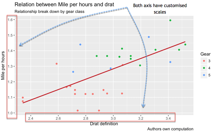
控制刻度
您可以控制轴的刻度。
当您需要创建数字序列时,seq() 函数非常方便。基本语法是
seq(begin, last, by = x)
arguments:
- begin: First number of the sequence
- last: Last number of the sequence
- by= x: The step. For instance, if x is 2, the code adds 2 to `begin-1` until it reaches `last`
例如,如果您想创建一个从 0 到 12 的范围,步长为 3,您将得到四个数字:0 4 8 12
seq(0, 12,4)
输出
## [1] 0 4 8 12
您可以按如下方式控制 x 轴和 y 轴的刻度
my_graph +
    scale_x_continuous(breaks = seq(1, 3.6, by = 0.2)) +
    scale_y_continuous(breaks = seq(1, 1.6, by = 0.1)) +
    labs(
        x = "Drat definition",
        y = "Mile per hours",
        color = "Gear",
        title = "Relation between Mile per hours and drat",
        subtitle = "Relationship break down by gear class",
        caption = "Authors own computation"
    )
代码解释
- scale_y_continuous() 函数控制y 轴
- scale_x_continuous() 函数控制x 轴。
- breaks 参数控制轴的分隔。您可以手动添加数字序列或使用 seq() 函数
- seq(1, 3.6, by = 0.2): 创建从 2.4 到 3.4 的六个数字,步长为 3
- seq(1, 1.6, by = 0.1): 创建从 1 到 1.6 的七个数字,步长为 1
输出
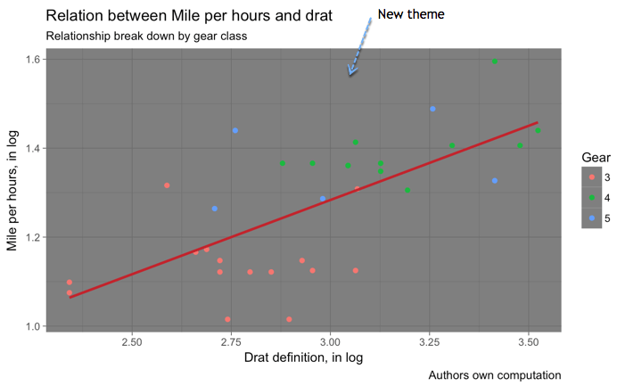
主题
最后,R 允许我们使用不同的主题自定义图表。ggplot2 库包含八个主题
- theme_bw()
- theme_light()
- theme_classis()
- theme_linedraw()
- theme_dark()
- theme_minimal()
- theme_gray()
- theme_void()
my_graph +
    theme_dark() +
    labs(
        x = "Drat definition, in log",
        y = "Mile per hours, in log",
        color = "Gear",
        title = "Relation between Mile per hours and drat",
        subtitle = "Relationship break down by gear class",
        caption = "Authors own computation"
    )
输出
保存图表
完成所有这些步骤后,就该保存和共享您的图表了。在绘制图表后立即添加 ggsave(‘FILE NAME’) 即可将其保存在硬盘上。
图表已保存在工作目录中。要检查工作目录,您可以运行此代码
directory <-getwd()
directory
让我们绘制您精彩的图表,保存它并检查位置
my_graph +
    theme_dark() +
    labs(
        x = "Drat definition, in log",
        y = "Mile per hours, in log",
        color = "Gear",
        title = "Relation between Mile per hours and drat",
        subtitle = "Relationship break down by gear class",
        caption = "Authors own computation"
    )
输出
ggsave("my_fantastic_plot.png")
输出
## Saving 5 x 4 in image
注意:出于教学目的,我们创建了一个名为 open_folder() 的函数来为您打开目录文件夹。您只需运行以下代码,看看图片存储在哪里。您应该会看到一个名为 my_fantastic_plot.png 的文件。
# Run this code to create the
function
open_folder <- function(dir) {
    if (.Platform['OS.type'] == "windows") {
        shell.exec(dir)
    } else {
        system(paste(Sys.getenv("R_BROWSER"), dir))
    }
}

# Call the
function to open the folder open_folder(directory)
摘要
您可以在下表中总结创建散点图的参数
| 目标 | 代码 |
|---|---|
| 基本散点图 |
ggplot(df, aes(x = x1, y = y)) + geom_point() |
| 带颜色分组的散点图 |
ggplot(df, aes(x = x1, y = y)) + geom_point(aes(color = factor(x1)) + stat_smooth(method = "lm") |
| 添加拟合值 |
ggplot(df, aes(x = x1, y = y)) + geom_point(aes(color = factor(x1)) |
| 添加标题 |
ggplot(df, aes(x = x1, y = y)) + geom_point() + labs(title = paste("Hello Guru99"))
|
| 添加副标题 |
ggplot(df, aes(x = x1, y = y)) + geom_point() + labs(subtitle = paste("Hello Guru99"))
|
| 重命名 x 轴 |
ggplot(df, aes(x = x1, y = y)) + geom_point() + labs(x = "X1") |
| 重命名 y 轴 |
ggplot(df, aes(x = x1, y = y)) + geom_point() + labs(y = "y1") |
| 控制刻度 |
ggplot(df, aes(x = x1, y = y)) + geom_point() + scale_y_continuous(breaks = seq(10, 35, by = 10)) + scale_x_continuous(breaks = seq(2, 5, by = 1) |
| 创建对数 |
ggplot(df, aes(x =log(x1), y = log(y))) + geom_point() |
| 主题 |
ggplot(df, aes(x = x1, y = y)) + geom_point() + theme_classic() |
| 保存 |
ggsave("my_fantastic_plot.png")
|