R 中的 GLM:广义线性模型示例
什么是逻辑回归?
逻辑回归用于预测一个类别,即一个概率。逻辑回归可以准确地预测二元结果。
假设您想根据许多属性预测贷款是被拒绝/接受。逻辑回归的形式为 0/1。如果贷款被拒绝,则 y = 0;如果贷款被接受,则 y = 1。
逻辑回归模型与线性回归模型在两个方面有所不同。
- 首先,逻辑回归仅接受二分(二进制)输入作为因变量(即 0 和 1 的向量)。
- 其次,结果由以下称为 **sigmoid** 的概率链接函数衡量,因为其 S 形。
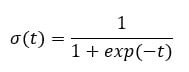
函数的输出始终在 0 到 1 之间。请参见下图
sigmoid 函数返回 0 到 1 之间的值。对于分类任务,我们需要一个离散的输出 0 或 1。
要将连续流转换为离散值,我们可以将决策边界设置为 0.5。此阈值以上的所有值都分类为 1
如何创建广义线性模型 (GLM)
我们将使用 **adult** 数据集来说明逻辑回归。“adult”数据集非常适合分类任务。目标是预测个人的年收入是否会超过 50,000 美元。该数据集包含 46,033 个观测值和十个特征
- age:个人的年龄。数值型
- education:个人的教育水平。因子型。
- marital.status:个人的婚姻状况。因子型,例如 Never-married, Married-civ-spouse, …
- gender:个人的性别。因子型,例如 Male 或 Female
- income:目标变量。收入高于或低于 50K。因子型,例如 >50K, <=50K
等等
library(dplyr)
data_adult <-read.csv("https://raw.githubusercontent.com/guru99-edu/R-Programming/master/adult.csv")
glimpse(data_adult)
输出
Observations: 48,842
Variables: 10
$ x               <int> 1, 2, 3, 4, 5, 6, 7, 8, 9, 10, 11, 12, 13, 14, 15,...
$ age             <int> 25, 38, 28, 44, 18, 34, 29, 63, 24, 55, 65, 36, 26...
$ workclass       <fctr> Private, Private, Local-gov, Private, ?, Private,...
$ education       <fctr> 11th, HS-grad, Assoc-acdm, Some-college, Some-col...
$ educational.num <int> 7, 9, 12, 10, 10, 6, 9, 15, 10, 4, 9, 13, 9, 9, 9,...
$ marital.status  <fctr> Never-married, Married-civ-spouse, Married-civ-sp...
$ race            <fctr> Black, White, White, Black, White, White, Black, ...
$ gender          <fctr> Male, Male, Male, Male, Female, Male, Male, Male,...
$ hours.per.week  <int> 40, 50, 40, 40, 30, 30, 40, 32, 40, 10, 40, 40, 39...
$ income          <fctr> <=50K, <=50K, >50K, >50K, <=50K, <=50K, <=50K, >5...
我们将按以下步骤进行:
- 步骤 1:检查连续变量
- 步骤 2:检查因子变量
- 步骤 3:特征工程
- 步骤 4:摘要统计
- 步骤 5:训练/测试集
- 步骤 6:构建模型
- 步骤 7:评估模型性能
- 步骤 8:改进模型
您的任务是预测哪些个人收入会高于 50K。
在本教程中,将详细介绍执行真实数据集分析的每个步骤。
步骤 1) 检查连续变量
在第一步中,您可以查看连续变量的分布。
continuous <-select_if(data_adult, is.numeric)
summary(continuous)
代码解释
- continuous <- select_if(data_adult, is.numeric):使用 dplyr 库中的 select_if() 函数仅选择数值列
- summary(continuous):打印摘要统计信息
输出
##        X              age        educational.num hours.per.week
##  Min.   :    1   Min.   :17.00   Min.   : 1.00   Min.   : 1.00
##  1st Qu.:11509   1st Qu.:28.00   1st Qu.: 9.00   1st Qu.:40.00
##  Median :23017   Median :37.00   Median :10.00   Median :40.00
##  Mean   :23017   Mean   :38.56   Mean   :10.13   Mean   :40.95
##  3rd Qu.:34525   3rd Qu.:47.00   3rd Qu.:13.00   3rd Qu.:45.00
##  Max.   :46033   Max.   :90.00   Max.   :16.00   Max.   :99.00
从上表中,您可以看到数据具有完全不同的尺度和工时。hours.per.weeks 存在很大的异常值(即查看最后一个四分位数和最大值)。
您可以按以下两个步骤处理它
- 1:绘制 hours.per.week 的分布图
- 2:标准化连续变量
- 绘制分布图
让我们仔细看看 hours.per.week 的分布
# Histogram with kernel density curve
library(ggplot2)
ggplot(continuous, aes(x = hours.per.week)) +
    geom_density(alpha = .2, fill = "#FF6666")
输出
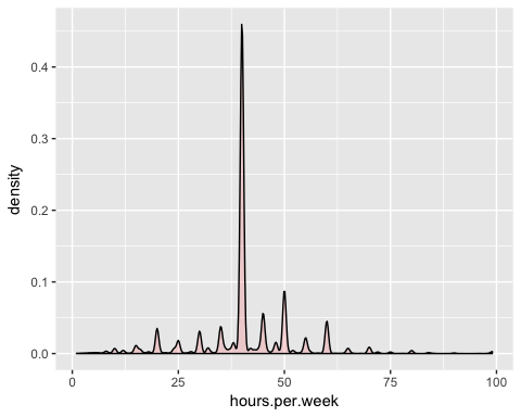
该变量有很多异常值且分布不明确。您可以通过删除前 0.01% 的每周工时来部分解决此问题。
分位数的语法
quantile(variable, percentile)
arguments:
-variable:  Select the variable in the data frame to compute the percentile
-percentile:  Can be a single value between 0 and 1 or multiple value. If multiple, use this format:  `c(A,B,C, ...)
- `A`,`B`,`C` and `...` are all integer from 0 to 1.
我们计算前 2% 的百分位数
top_one_percent <- quantile(data_adult$hours.per.week, .99)
top_one_percent
代码解释
- quantile(data_adult$hours.per.week, .99):计算 99% 工作时间的数值
输出
## 99%
##  80
98% 的人口每周工作时间少于 80 小时。
您可以删除高于此阈值的观测值。您可以使用 dplyr 库中的 filter。
data_adult_drop <-data_adult %>%
filter(hours.per.week<top_one_percent)
dim(data_adult_drop)
输出
## [1] 45537 10
- 标准化连续变量
您可以标准化每个列以提高性能,因为您的数据没有相同的尺度。您可以使用 dplyr 库中的 mutate_if 函数。基本语法是
mutate_if(df, condition, funs(function))
arguments:
-`df`: Data frame used to compute the function
- `condition`: Statement used. Do not use parenthesis
- funs(function):  Return the function to apply. Do not use parenthesis for the function
您可以按如下方式标准化数值列
data_adult_rescale <- data_adult_drop % > %
	mutate_if(is.numeric, funs(as.numeric(scale(.))))
head(data_adult_rescale)
代码解释
- mutate_if(is.numeric, funs(scale)):条件仅为数值列,函数为 scale
输出
##           X         age        workclass    education educational.num
## 1 -1.732680 -1.02325949          Private         11th     -1.22106443
## 2 -1.732605 -0.03969284          Private      HS-grad     -0.43998868
## 3 -1.732530 -0.79628257        Local-gov   Assoc-acdm      0.73162494
## 4 -1.732455  0.41426100          Private Some-college     -0.04945081
## 5 -1.732379 -0.34232873          Private         10th     -1.61160231
## 6 -1.732304  1.85178149 Self-emp-not-inc  Prof-school      1.90323857
##       marital.status  race gender hours.per.week income
## 1      Never-married Black   Male    -0.03995944  <=50K
## 2 Married-civ-spouse White   Male     0.86863037  <=50K
## 3 Married-civ-spouse White   Male    -0.03995944   >50K
## 4 Married-civ-spouse Black   Male    -0.03995944   >50K
## 5      Never-married White   Male    -0.94854924  <=50K
## 6 Married-civ-spouse White   Male    -0.76683128   >50K
步骤 2) 检查因子变量
此步骤有两个目标
- 检查每个分类列中的级别
- 定义新级别
我们将此步骤分为三个部分
- 选择分类列
- 将每列的条形图存储在列表中
- 打印图形
您可以使用以下代码选择因子列
# Select categorical column
factor <- data.frame(select_if(data_adult_rescale, is.factor))
	ncol(factor)
代码解释
- data.frame(select_if(data_adult, is.factor)):我们将因子列存储在 factor 中,类型为数据框。ggplot2 库需要数据框对象。
输出
## [1] 6
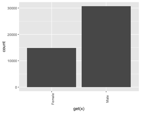
该数据集包含 6 个分类变量
第二步更具技术性。您想为 factor 数据框中的每一列绘制条形图。自动化该过程更方便,尤其是在有很多列的情况下。
library(ggplot2)
# Create graph for each column
graph <- lapply(names(factor),
    function(x)
	ggplot(factor, aes(get(x))) +
		geom_bar() +
		theme(axis.text.x = element_text(angle = 90)))
代码解释
- lapply(): 使用 lapply() 函数将一个函数应用于数据集中的所有列。您将输出存储在列表中
- function(x):函数将对每个 x 进行处理。这里 x 是列
- ggplot(factor, aes(get(x))) + geom_bar()+ theme(axis.text.x = element_text(angle = 90)):为每个 x 元素创建一个条形图。注意,要将 x 作为列返回,您需要将其包含在 get() 中
最后一步相对容易。您想打印这 6 个图形。
# Print the graph
graph
输出
## [[1]]
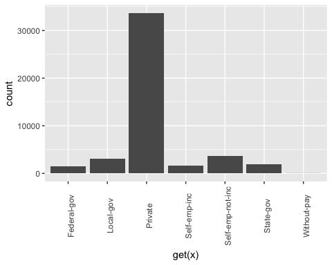
## ## [[2]]
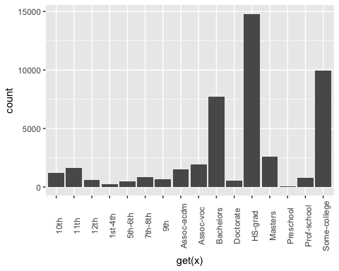
## ## [[3]]
## ## [[4]]
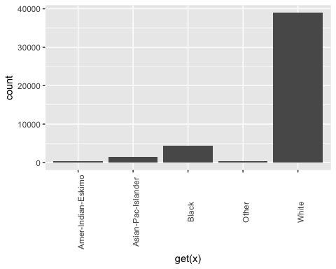
## ## [[5]]
## ## [[6]]
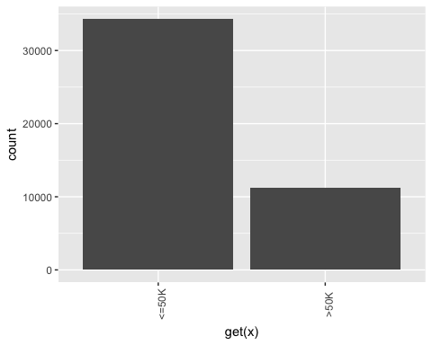
注意:使用下一个按钮导航到下一个图形
步骤 3) 特征工程
重构教育
从上面的图形中,您可以看到 education 变量有 16 个级别。这相当多,并且一些级别上的观测值相对较少。如果您想从该变量中获得更多信息,可以将其重构成更高级别。即,您可以创建具有相似教育水平的较大组。例如,低教育水平将转换为 dropout。更高的教育水平将转换为 master。
细节如下
| 旧级别 | 新级别 |
|---|---|
| 学前 | 辍学 |
| 10年级 | 辍学 |
| 11年级 | 辍学 |
| 12年级 | 辍学 |
| 1-4年级 | 辍学 |
| 5-6年级 | 辍学 |
| 7-8年级 | 辍学 |
| 9年级 | 辍学 |
| 高中毕业 | 高中毕业 |
| 部分大学 | 社区 |
| 副学士学位(学术) | 社区 |
| 副学士学位(职业) | 社区 |
| 学士学位 | 学士学位 |
| 硕士学位 | 硕士学位 |
| 专业学校 | 硕士学位 |
| 博士学位 | 博士学位 |
recast_data <- data_adult_rescale % > %
	select(-X) % > %
	mutate(education = factor(ifelse(education == "Preschool" | education == "10th" | education == "11th" | education == "12th" | education == "1st-4th" | education == "5th-6th" | education == "7th-8th" | education == "9th", "dropout", ifelse(education == "HS-grad", "HighGrad", ifelse(education == "Some-college" | education == "Assoc-acdm" | education == "Assoc-voc", "Community",
    ifelse(education == "Bachelors", "Bachelors",
        ifelse(education == "Masters" | education == "Prof-school", "Master", "PhD")))))))
代码解释
- 我们使用 dplyr 库中的 mutate 动词。我们使用 ifelse 语句更改 education 的值
在下表中,您将创建一个摘要统计信息,以查看平均需要多少年(z 值)的教育才能获得学士、硕士或博士学位。
recast_data % > %
	group_by(education) % > %
	summarize(average_educ_year = mean(educational.num),
		count = n()) % > %
	arrange(average_educ_year)
输出
## # A tibble: 6 x 3
## education average_educ_year count
##      <fctr>             <dbl> <int>
## 1   dropout       -1.76147258  5712
## 2  HighGrad       -0.43998868 14803
## 3 Community        0.09561361 13407
## 4 Bachelors        1.12216282  7720
## 5    Master        1.60337381  3338
## 6       PhD        2.29377644   557
重构婚姻状况
也可以为婚姻状况创建较低级别。在以下代码中,您将级别更改为如下
| 旧级别 | 新级别 |
|---|---|
| 未婚 | 未婚 |
| 已婚-配偶缺席 | 未婚 |
| 已婚-军人配偶 | 已婚 |
| 已婚-文职配偶 | |
| 已分居 | 已分居 |
| 已离婚 | |
| 寡妇 | 寡妇 |
# Change level marry
recast_data <- recast_data % > %
	mutate(marital.status = factor(ifelse(marital.status == "Never-married" | marital.status == "Married-spouse-absent", "Not_married", ifelse(marital.status == "Married-AF-spouse" | marital.status == "Married-civ-spouse", "Married", ifelse(marital.status == "Separated" | marital.status == "Divorced", "Separated", "Widow")))))
您可以查看每个组中的个人数量。
table(recast_data$marital.status)
输出
## ##     Married Not_married   Separated       Widow
##       21165       15359        7727        1286
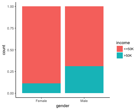
步骤 4) 摘要统计
现在是时候检查我们目标变量的一些统计数据了。在下图表中,您计算了根据性别收入超过 50k 的个人百分比。
# Plot gender income
ggplot(recast_data, aes(x = gender, fill = income)) +
    geom_bar(position = "fill") +
    theme_classic()
输出
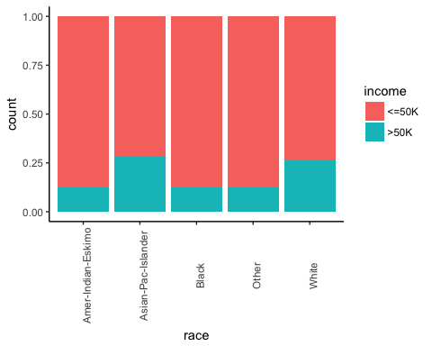
接下来,检查个人的出身是否会影响他们的收入。
# Plot origin income
ggplot(recast_data, aes(x = race, fill = income)) +
    geom_bar(position = "fill") +
    theme_classic() +
    theme(axis.text.x = element_text(angle = 90))
输出
按性别划分的工作小时数。
# box plot gender working time
ggplot(recast_data, aes(x = gender, y = hours.per.week)) +
    geom_boxplot() +
    stat_summary(fun.y = mean,
        geom = "point",
        size = 3,
        color = "steelblue") +
    theme_classic()
输出
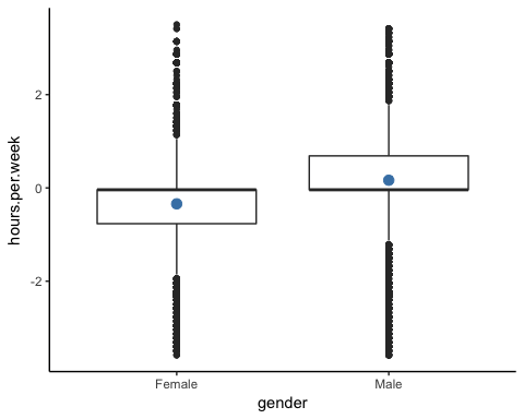
箱线图证实了工作时间的分布适合不同的群体。在箱线图中,两性之间没有同质的观测值。
您可以按教育类型检查每周工作时间的密度。分布有许多不同的峰值。这可能可以解释为美国的工作合同类型。
# Plot distribution working time by education
ggplot(recast_data, aes(x = hours.per.week)) +
    geom_density(aes(color = education), alpha = 0.5) +
    theme_classic()
代码解释
- ggplot(recast_data, aes( x= hours.per.week)):密度图只需要一个变量
- geom_density(aes(color = education), alpha =0.5):控制密度的几何对象
输出
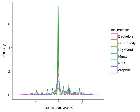
为了确认您的想法,您可以执行单向 **ANOVA 检验**
anova <- aov(hours.per.week~education, recast_data)
summary(anova)
输出
##                Df Sum Sq Mean Sq F value Pr(>F)
## education       5   1552  310.31   321.2 <2e-16 ***
## Residuals   45531  43984    0.97
## ---
## Signif. codes:  0 '***' 0.001 '**' 0.01 '*' 0.05 '.' 0.1 ' ' 1
ANOVA 检验证实了组间平均值的差异。
非线性
在运行模型之前,您可以查看每周工作小时数是否与年龄相关。
library(ggplot2)
ggplot(recast_data, aes(x = age, y = hours.per.week)) +
    geom_point(aes(color = income),
        size = 0.5) +
    stat_smooth(method = 'lm',
        formula = y~poly(x, 2),
        se = TRUE,
        aes(color = income)) +
    theme_classic()
代码解释
- ggplot(recast_data, aes(x = age, y = hours.per.week)):设置图形的美学
- geom_point(aes(color= income), size =0.5):构建散点图
- stat_smooth():使用以下参数添加趋势线
- method=’lm’:绘制 **线性回归** 的拟合值
- formula = y~poly(x,2):拟合多项式回归
- se = TRUE:添加标准误差
- aes(color= income):按收入划分模型
输出
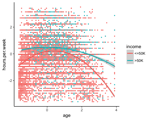
总之,您可以测试模型中的交互项以捕捉每周工作时间与其他特征之间的非线性效应。重要的是要检测在什么条件下工作时间会有所不同。
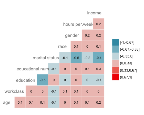
相关性
接下来的检查是可视化变量之间的相关性。我们将因子级别类型转换为数值型,以便可以绘制包含使用 Spearman 方法计算的相关系数的热图。
library(GGally)
# Convert data to numeric
corr <- data.frame(lapply(recast_data, as.integer))
# Plot the graphggcorr(corr,
    method = c("pairwise", "spearman"),
    nbreaks = 6,
    hjust = 0.8,
    label = TRUE,
    label_size = 3,
    color = "grey50")
代码解释
- data.frame(lapply(recast_data,as.integer)):将数据转换为数值型
- ggcorr() 使用以下参数绘制热图
- method:计算相关性的方法
- nbreaks = 6:中断数
- hjust = 0.8:控制图中变量名称的位置
- label = TRUE:在窗口中心添加标签
- label_size = 3:标签大小
- color = “grey50”):标签的颜色
输出
步骤 5) 训练/测试集
任何监督 **机器学习** 任务都需要将数据拆分为训练集和测试集。您可以使用在其他监督学习教程中创建的“函数”来创建训练/测试集。
set.seed(1234)
create_train_test <- function(data, size = 0.8, train = TRUE) {
    n_row = nrow(data)
    total_row = size * n_row
    train_sample <- 1: total_row
    if (train == TRUE) {
        return (data[train_sample, ])
    } else {
        return (data[-train_sample, ])
    }
}
data_train <- create_train_test(recast_data, 0.8, train = TRUE)
data_test <- create_train_test(recast_data, 0.8, train = FALSE)
dim(data_train)
输出
## [1] 36429 9
dim(data_test)
输出
## [1] 9108 9
步骤 6) 构建模型
为了查看算法的性能,我们使用 glm() 包。**广义线性模型** 是模型的集合。基本语法是
glm(formula, data=data, family=linkfunction()
Argument:
- formula:  Equation used to fit the model- data: dataset used
- Family:     - binomial: (link = "logit")
- gaussian: (link = "identity")
- Gamma:    (link = "inverse")
- inverse.gaussian: (link = "1/mu^2")
- poisson:  (link = "log")
- quasi:    (link = "identity", variance = "constant")
- quasibinomial:    (link = "logit")
- quasipoisson: (link = "log")
我们准备好估计逻辑模型,以在一组特征中划分收入水平。
formula <- income~.
logit <- glm(formula, data = data_train, family = 'binomial')
summary(logit)
代码解释
- formula <- income ~ .:创建要拟合的模型
- logit <- glm(formula, data = data_train, family = ‘binomial’): 使用 data_train 数据拟合逻辑模型(family = ‘binomial’)。
- summary(logit):打印模型的摘要
输出
##
## Call:
## glm(formula = formula, family = "binomial", data = data_train)
## ## Deviance Residuals:
##     Min       1Q   Median       3Q      Max
## -2.6456  -0.5858  -0.2609  -0.0651   3.1982
##
## Coefficients:
##                           Estimate Std. Error z value Pr(>|z|)
## (Intercept)                0.07882    0.21726   0.363  0.71675
## age                        0.41119    0.01857  22.146  < 2e-16 ***
## workclassLocal-gov        -0.64018    0.09396  -6.813 9.54e-12 ***
## workclassPrivate          -0.53542    0.07886  -6.789 1.13e-11 ***
## workclassSelf-emp-inc     -0.07733    0.10350  -0.747  0.45499
## workclassSelf-emp-not-inc -1.09052    0.09140 -11.931  < 2e-16 ***
## workclassState-gov        -0.80562    0.10617  -7.588 3.25e-14 ***
## workclassWithout-pay      -1.09765    0.86787  -1.265  0.20596
## educationCommunity        -0.44436    0.08267  -5.375 7.66e-08 ***
## educationHighGrad         -0.67613    0.11827  -5.717 1.08e-08 ***
## educationMaster            0.35651    0.06780   5.258 1.46e-07 ***
## educationPhD               0.46995    0.15772   2.980  0.00289 **
## educationdropout          -1.04974    0.21280  -4.933 8.10e-07 ***
## educational.num            0.56908    0.07063   8.057 7.84e-16 ***
## marital.statusNot_married -2.50346    0.05113 -48.966  < 2e-16 ***
## marital.statusSeparated   -2.16177    0.05425 -39.846  < 2e-16 ***
## marital.statusWidow       -2.22707    0.12522 -17.785  < 2e-16 ***
## raceAsian-Pac-Islander     0.08359    0.20344   0.411  0.68117
## raceBlack                  0.07188    0.19330   0.372  0.71001
## raceOther                  0.01370    0.27695   0.049  0.96054
## raceWhite                  0.34830    0.18441   1.889  0.05894 .
## genderMale                 0.08596    0.04289   2.004  0.04506 *
## hours.per.week             0.41942    0.01748  23.998  < 2e-16 ***
## ---## Signif. codes:  0 '***' 0.001 '**' 0.01 '*' 0.05 '.' 0.1 ' ' 1
## ## (Dispersion parameter for binomial family taken to be 1)
## ##     Null deviance: 40601  on 36428  degrees of freedom
## Residual deviance: 27041  on 36406  degrees of freedom
## AIC: 27087
##
## Number of Fisher Scoring iterations: 6
我们的模型摘要揭示了有趣的信息。逻辑回归的性能通过特定的关键指标进行评估。
- AIC(赤池信息准则):这是逻辑回归中 **R2** 的等效项。它衡量应用了参数数量惩罚时的拟合度。较小的 **AIC** 值表示模型更接近真实。
- Null deviance:仅拟合截距的模型。自由度为 n-1。我们可以将其解释为卡方值(拟合值与实际值不同的假设检验)。
- Residual Deviance:所有变量的模型。它也被解释为卡方假设检验。
- Fisher Scoring 迭代次数:收敛前的迭代次数。
glm() 函数的输出存储在一个列表中。下面的代码显示了我们在 logit 变量中可用的所有项,该变量用于评估逻辑回归。
# 列表非常长,仅打印前三个元素
lapply(logit, class)[1:3]
输出
## $coefficients
## [1] "numeric"
##
## $residuals
## [1] "numeric"
##
## $fitted.values
## [1] "numeric"
每个值都可以通过 $ 符号后跟指标名称来提取。例如,您将模型存储为 logit。要提取 AIC 标准,请使用
logit$aic
输出
## [1] 27086.65
步骤 7) 评估模型性能
混淆矩阵
与之前看到的各种指标相比,**混淆矩阵** 是评估分类性能的更好选择。基本思想是计算将真实例分类为假实例的次数。
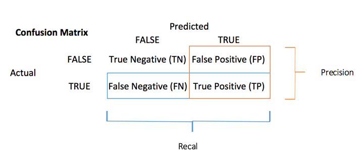
要计算混淆矩阵,您首先需要有一组预测,以便可以将其与实际目标进行比较。
predict <- predict(logit, data_test, type = 'response')
# confusion matrix
table_mat <- table(data_test$income, predict > 0.5)
table_mat
代码解释
- predict(logit,data_test, type = ‘response’): 在测试集上计算预测。设置 type = ‘response’ 以计算响应概率。
- table(data_test$income, predict > 0.5):计算混淆矩阵。predict > 0.5 表示如果预测概率高于 0.5,则返回 1,否则返回 0。
输出
##
##         FALSE TRUE
##   <=50K  6310  495
##   >50K   1074 1229
混淆矩阵中的每一行代表一个实际目标,而每一列代表一个预测目标。此矩阵的第一行考虑收入低于 50k(假类):6241 被正确分类为收入低于 50k 的个体(**真阴性**),而其余一个被错误分类为高于 50k(**假阳性**)。第二行考虑收入高于 50k,1229 为阳性类别(**真阳性**),而 **假阴性** 为 1074。
您可以通过将真阳性 + 真阴性除以总观测数来计算模型的 **准确率**
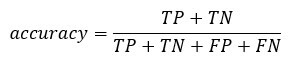
accuracy_Test <- sum(diag(table_mat)) / sum(table_mat)
accuracy_Test
代码解释
- sum(diag(table_mat)):对角线之和
- sum(table_mat):矩阵之和。
输出
## [1] 0.8277339
该模型似乎存在一个问题,它过高估计了假阴性的数量。这被称为**准确率测试悖论**。我们说过,准确率是正确预测数与总案例数的比率。即使准确率相对较高,模型也可能无用。当存在占主导地位的类别时,就会发生这种情况。如果您回顾混淆矩阵,您会发现大多数案例都被分类为真阴性。现在想象一下,模型将所有类别都分类为阴性(即低于 50k)。您的准确率为 75%(6718/6718+2257)。您的模型表现更好,但在区分真阳性与假阴性方面存在困难。
在这种情况下,最好有一个更简洁的指标。我们可以查看
- 精确率=TP/(TP+FP)
- 召回率=TP/(TP+FN)
精确率与召回率
**精确率** 关注阳性预测的准确性。**召回率** 是被分类器正确检测到的阳性实例的比例;
您可以构建两个函数来计算这两个指标
- 构造精确率
precision <- function(matrix) {
	# True positive
    tp <- matrix[2, 2]
	# false positive
    fp <- matrix[1, 2]
    return (tp / (tp + fp))
}
代码解释
- mat[1,1]:返回数据框第一列的第一个单元格,即真阳性
- mat[1,2];返回数据框第二列的第一个单元格,即假阳性
recall <- function(matrix) {
# true positive
    tp <- matrix[2, 2]# false positive
    fn <- matrix[2, 1]
    return (tp / (tp + fn))
}
代码解释
- mat[1,1]:返回数据框第一列的第一个单元格,即真阳性
- mat[2,1];返回数据框第一列的第二个单元格,即假阴性
您可以测试您的函数
prec <- precision(table_mat)
prec
rec <- recall(table_mat)
rec
输出
## [1] 0.712877
## [2] 0.5336518
当模型说某人收入高于 50k 时,在 54% 的情况下是正确的,并且在 72% 的情况下可以声称某人收入高于 50k。
您可以创建 **精确率与召回率** 的图![]() 基于精确率和召回率的得分。 **F1 分数**
基于精确率和召回率的得分。 **F1 分数**![]() 是这两个指标的调和平均值,这意味着它更侧重于较低的值。
是这两个指标的调和平均值,这意味着它更侧重于较低的值。
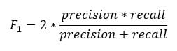
f1 <- 2 * ((prec * rec) / (prec + rec))
f1
输出
## [1] 0.6103799
精确率与召回率的权衡
不可能同时拥有高精确率和高召回率。
如果我们提高精确率,正确识别的个体将被更好地预测,但我们会错过很多(召回率降低)。在某些情况下,我们更喜欢更高的精确率而不是召回率。精确率和召回率之间存在凹形关系。
- 想象一下,您需要预测患者是否患有某种疾病。您希望尽可能精确。
- 如果您需要通过面部识别来预测街上的潜在欺诈者,那么最好能捕获许多标记为欺诈者的人,即使精确率很低。警方可以释放非欺诈者。
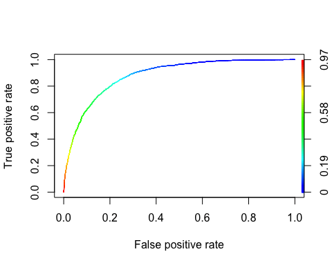
ROC 曲线
**接收者操作特征** (ROC) 曲线是二元分类中使用的另一种常用工具。它与精确率/召回率曲线非常相似,但它不是绘制精确率与召回率,而是绘制真正率(即召回率)与假正率。假正率是负实例被错误分类为正实例的比例。它等于 1 减去真阴率。真阴率也称为 **特异度**。因此,ROC 曲线绘制 **敏感度**(召回率)与 1-特异度
要绘制 ROC 曲线,我们需要安装一个名为 RORC 的库。我们可以在 conda **库** 中找到它。您可以键入代码
conda install -c r r-rocr –yes
我们可以使用 prediction() 和 performance() 函数来绘制 ROC。
library(ROCR)
ROCRpred <- prediction(predict, data_test$income)
ROCRperf <- performance(ROCRpred, 'tpr', 'fpr')
plot(ROCRperf, colorize = TRUE, text.adj = c(-0.2, 1.7))
代码解释
- prediction(predict, data_test$income):ROCR 库需要创建一个 prediction 对象来转换输入数据
- performance(ROCRpred, ‘tpr’,’fpr’):返回产生图形的两个组合。这里,tpr 和 fpr 被构造出来。要一起绘制精确率和召回率,请使用“prec”、“rec”。
输出
**步骤 8)** 改进模型
您可以尝试通过以下方式为模型添加非线性:
- 年龄和每周工时之间的交互
- 性别和每周工时之间的交互。
您需要使用得分检验来比较这两个模型
formula_2 <- income~age: hours.per.week + gender: hours.per.week + .
logit_2 <- glm(formula_2, data = data_train, family = 'binomial')
predict_2 <- predict(logit_2, data_test, type = 'response')
table_mat_2 <- table(data_test$income, predict_2 > 0.5)
precision_2 <- precision(table_mat_2)
recall_2 <- recall(table_mat_2)
f1_2 <- 2 * ((precision_2 * recall_2) / (precision_2 + recall_2))
f1_2
输出
## [1] 0.6109181
得分略高于之前的模型。您可以继续处理数据,尝试击败该得分。
摘要
我们可以在下表中总结训练逻辑回归的函数
| 包 | 目标 | 函数 | 论证 |
|---|---|---|---|
| – | 创建训练/测试数据集 | create_train_set() | data, size, train |
| glm | 训练广义线性模型 | glm() | formula, data, family* |
| glm | 总结模型 | summary() | 拟合模型 |
| base | 进行预测 | predict() | fitted model, dataset, type = ‘response’ |
| base | 创建混淆矩阵 | table() | y, predict() |
| base | 创建准确率得分 | sum(diag(table())/sum(table() | |
| ROCR | 创建 ROC:步骤 1 创建预测 | prediction() | predict(), y |
| ROCR | 创建 ROC:步骤 2 创建性能 | performance() | prediction(), ‘tpr’, ‘fpr’ |
| ROCR | 创建 ROC:步骤 3 绘制图形 | plot() | performance() |
其他的 **GLM** 类型模型是
– binomial: (link = “logit”)
– gaussian: (link = “identity”)
– Gamma: (link = “inverse”)
– inverse.gaussian: (link = “1/mu^2”)
– poisson: (link = “log”)
– quasi: (link = “identity”, variance = “constant”)
– quasibinomial: (link = “logit”)
– quasipoisson: (link = “log”)